Revamping the State Budget Sites
Modernize the UX, DX and tech stacks for the Governor's budget sites
Visit Live SiteOverview
As part of the state budgeting process, throughout each fiscal year, a small team of budget analysts and web masters within the Executive Office for Administration and Finance (ANF) are tasked to edit and publish a data-driven microsite for each of the three budget types — the governor's budget proposal, the enacted budget summary and a five-year capital budget plan.
The goals of this project were two folds:
- Make the three budget sites look and feel consistently with Mass.gov and the rest of the state web ecosystem. Improve the end user experience, make the websites responsive across devices, accessible to keyboard and screen reader users, and usable and useful to both the budget power users and the general public.
- Improve how the budget team process data and generate the microsites, address pain points in their process. Create a workflow that the team can fully own.
Background
Each publishing process involves a lot of cross-department coordinations, back-and-forth and live changes. To add onto the already stressful process, the web team was stuck with legacy tech stacks that required dealing with very outdated and slow operation systems, for example, a 32-bit computer was used to run a 16-bit FoxPro program. Static web pages were generated from the database exports with Visual Basic scripts (a programming language that was declared legacy in 2008). The generated HTML and CSS had long been failing responsiveness and accessibility requirements. The source code were not version-controlled and became unmaintainable. However, due to the complexity of the budgeting process, the diverse stakeholders involved, and the rigorous approval timelines, previous overhaul attempts to modernizing the front-end and the generation tech stacks ended nowhere.
My Roles
User research
On top of the most obvious opportunities for usability improvements, such like making the pages responsive, the content searchable, and the data tables filterable and sortable, I used CrazyEgg to measure how user browsed and interacted with the budget sites in conjunction with TreeJack tests to benchmark and identify the IA and navigational improvements.
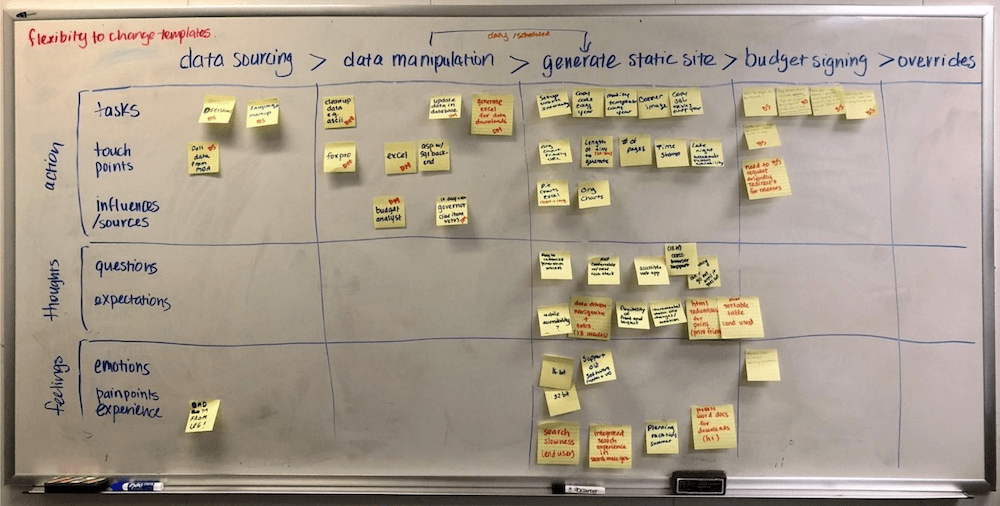
Developer experience (DX) journey mapping
Good developer experience and modern toolset empower the building of a better end-user experience. Meeting with technical stakeholders, listening to and understanding their needs and desires, was a necessary step that often overlooked. Journey mapping is a great exercise to develop empathy around the people and the process, and create consensus with the stakeholders. I gathered the key stakeholders who were also the technical team in a room at the start of the project and invited them to map out each step in their process, including the tools they used, the people/organization they interacted with, their expectations and their pain points, etc.

Project management
Making changes to an established process is never easy. It involves everyone being onboard and vested in the new process. We know from the beginning that the overhaul is not just for the front-end design and end-user experience, but also for the improvement to the tooling and developer experience that are involved in the generation of the websites going forward. The key to the project success was building trust with the stakeholders, setting up regular updates and communications from the get-go, being empathetic to their priorities and ensure the new process did not disrupt their existing job duties.
Technical solutioning
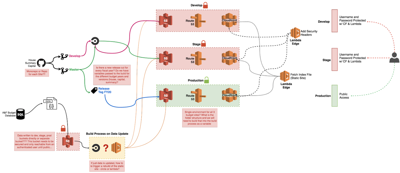
Learning from the prior failed ventures, we focused on finding a solution that was closely aligned with the existing process so that we could improve and migrate the operations progressively. Replacing the legacy programs with JAMstack - a new standard architecture using git workflow and modern build tools to server-side render APIs into static pages substantially sped up the build process, made the sites more performant and allowed the design improvements to made both for the developer experience and the end user experience.

Design and Development
I created wireframes and high-fidelity design mockups, drafted design and technical scopes for front-end components and page templates, as well as designing back-end data schema and data pipeline, building out data plugins, and developing and deploying the sites.