Unemployment User Journey Mapping
Rethink one of the most challenging public services based on user needs
Overview
The Executive Office of Labor and Workforce Development (LWD) and the Massachusetts Digital Service initiated a cross-secretariat joint effort to take a human-centered approach to improve the constituents interactions with the state's unemployment services. Collaborated with both the executive leadership at LWD and boots-on-the-ground service providers at Department of Unemployment Assistance (DUA) and MassHire Department of Career Services (MDCS), our team mapped out the end-to-end user journey for unemployed residents and jobseekers in Massachusetts — from the moment of losing their job to receiving the first unemployment check, maintaining weekly eligibility, and getting re-employed. This effort led to some quick-wins solutions that immediately assisted the constituents, and continues to guide the organization's priorities to improve its public services and organizational culture.
Background
There were a few high-level challenges that we faced with:
- The organization was dependent on a suite of outdated digital and analog tools that compromised its ability to deliver critical unemployment and career services.
- Widespread burnout and low job satisfaction among overworked, under-supported DUA employees caused an increasingly high turnover rate.
- Changes in labor markets and technology mean that more and more people would need career assistance and retraining.
In order to address these challenges holistically, we must first understand the needs of both the constituents and the state employees providing the services.
Research
First step to get to understand the needs of our users was to get some preliminary data from them directly. We designed a survey and sent it out to ~25,000 people who had applied for unemployment insurance (UI) within the last year and received ~1,300 responses. The responses provided an aggregate (quantitative) view of our users about their behaviors, experiences and demographics, which helped us create meaningful segments and informed our persona creation.
To develop a deeper understanding and empathy for our users, we conducted multi-faceted qualitative research, which happened in person with different groups of users in different environments:
- We recruited and interviewed business owners in Massachusetts about their experiences with DUA services
- We spoke to DUA and MDCS employees to gain a first-hand understanding of what it’s like to work in the organization
- We spent a day at Franklin-Hampshire Career Center in Greenfield and a day at Fall River Career Center, as well as half a day at the DUA Walk-In Center in Boston. We sat in career seminars, observed how the career services users navigated the resources, most importantly, talked to 46 people about their experiences with UI and career services.
These interviews provided us with an all-around view of the process from combined human perspectives. The people we spoke to spanned all ages, industries, and demographics, provided us personal accounts of various experiences.
Synthesis and Ideation

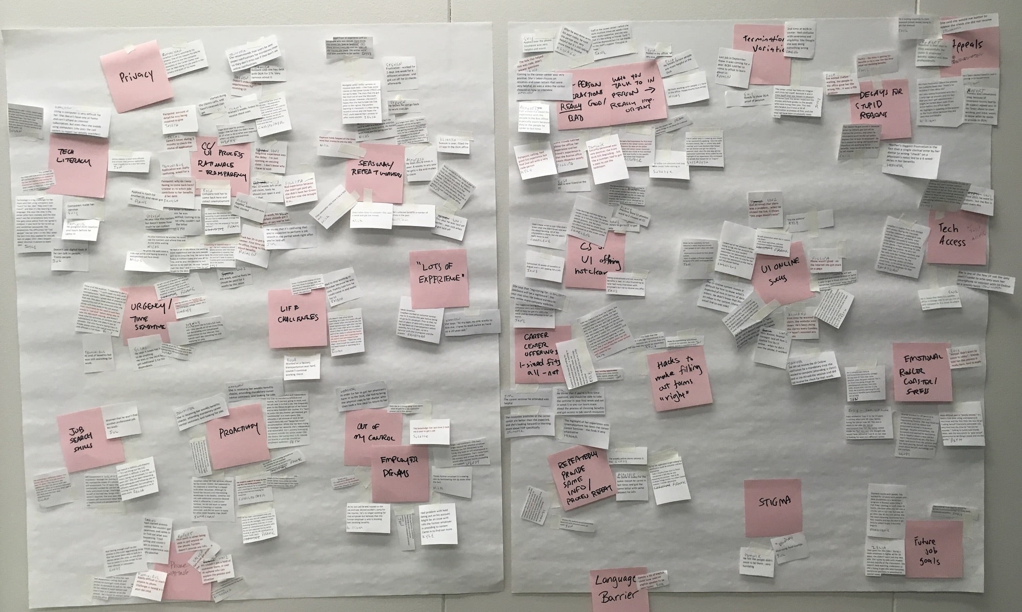
Back in the office, we began to synthesize our findings into key themes and insights through the affinity mapping exercise and crafted 6 final personas, representing all user types varied by age, industry, unemployment stage, primary language, and how tech-savvy and proactive they were.

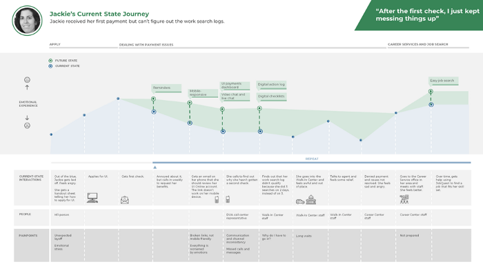
We took these personas into the concept sprint, an intensive ideation workshop, and charted their current state journey — mapping the emotions they go through, the tools they use, the people they interacted with, and their pain points at each step.
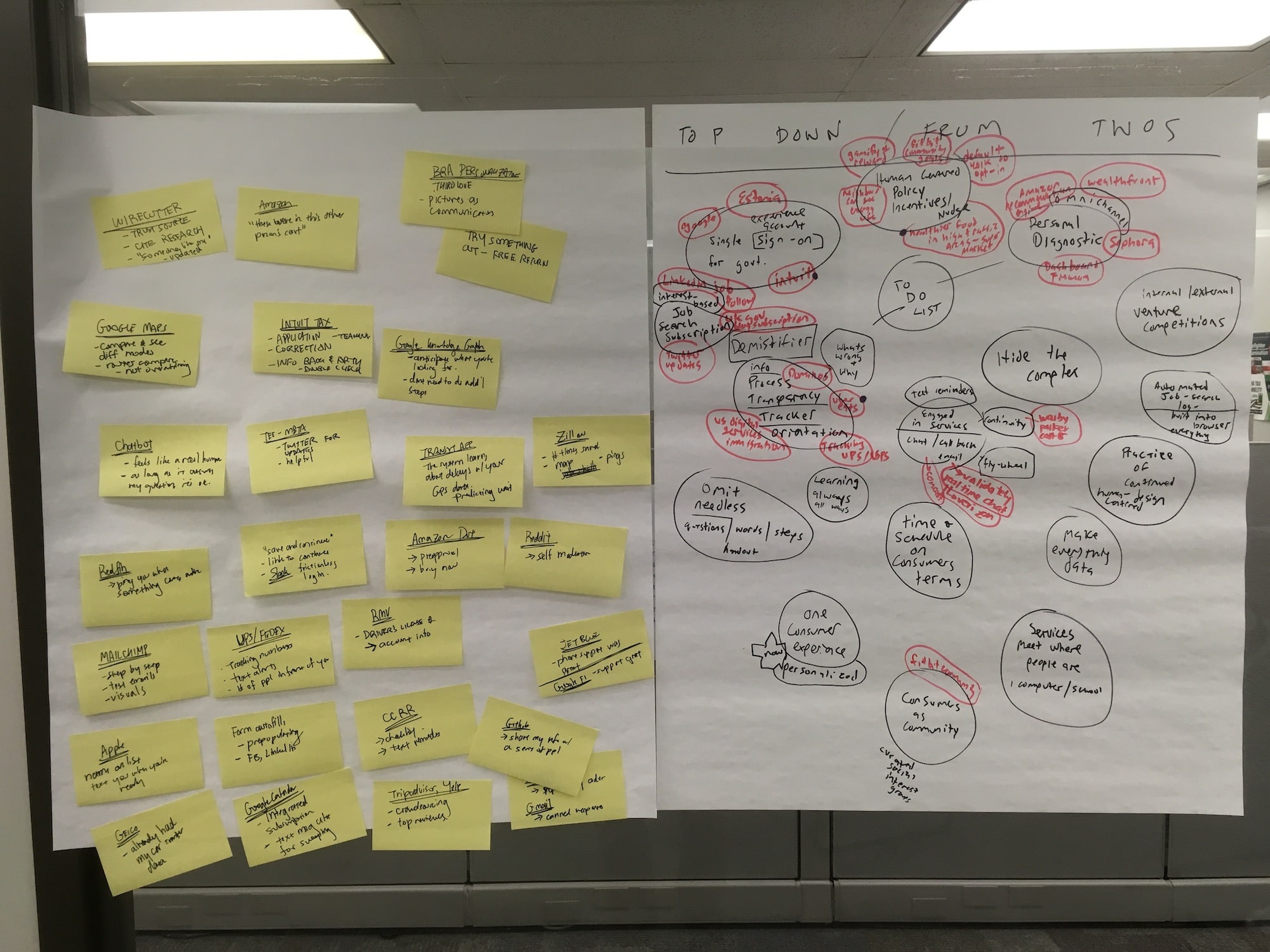
In brainstorming breakout sessions, we collaboratively generated ideas to alleviate the current pain points and mapped out their future state journeys with the improvements. We consolidated and finalized the solutions into quick-wins as well as north-star goals, and presented them to the senior management team of LWD.

My Role
As a design and research practice representative on the Digital Service team, I contributed in all the research phases — from drafting interview plans, conducting on-site interviews at career centers and taking notes, to facilitating user journey mapping workshops and developing actionable insights at the concept sprint.
As part of the approved quick-win solutions, I designed, prototyped and tested the online calculators to help UI claimants and seasonal workers quickly estimate their eligibility and benefit amounts without having to navigate the complicated formulas on their own. I also help design and develop the front-end of a multilingual unemployment benefits application portal to augment the existing UI online claimant portal.
These implementations were tested and refined with the real users. Along with the work done by the content team, we were able to help reduce the confusion and frustration of those who were going through this already stressful life experience and assist call-center operators by reducing their work answering some reoccurring questions regarding UI benefits.